
Liquid Effect with SVG filters
We can use SVG filters with tag <filter> to apply graphical operations on one or more inputs and generate a result that can be passed to a DOM element or another SVG filter to create a combination of interesting effects.
<filter> defines a custom filter effect by grouping atomic filter primitives. It doesn’t render itself, but it can be used by the filter attribute on an SVG element, or filter property in CSS. The support on modern browser is pretty great, please check the browser compatibility on MDN web docs for reference.
Example with <feGaussianBlue>
This primitive filter takes an input and apply a blurring effect based on stdDeviation attribute value.
<svg
  width="230"
  height="120"
  xmlns="http://www.w3.org/2000/svg"
  xmlns:xlink="http://www.w3.org/1999/xlink"
>
  <filter id="blurMe">
    <feGaussianBlur in="SourceGraphic" stdDeviation="5" />
  </filter>

  <circle cx="170" cy="60" r="50" fill="green" filter="url(#blurMe)" />
</svg>
result:
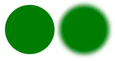
inattribute defines the input, here we useSourceGraphicto use the original graphic element.stdDeviationattribute defines the standard deviation for the blur operation. If two numbers are provided, the first number is for standard deviation for x-axis, and the second one is for y-axis.
To use the effect you just defined you can either apply it on an SVG element with attribute filter = "url(#filterId)" or with CSS property:
.item {
  filter: url('#filterId');
}
The result of one filter can be assigned a name with attribute result, and then passes to another filter with attribute in. This make countless combinations of effects you can use.
Applying Liquid Effect
HTML markup from the demo:
<div class="share-menu-wrapper">

  <div class="share-menu-item">
    <div class="menu-wrapper menu-item">
      <a href="#" class="menu-link"><i class="fab fa-twitter"></i></a>
    </div>
  </div>

  <div class="share-menu-item">
    <div class="menu-wrapper menu-item">
      <a href="#" class="menu-link"><i class="fab fa-facebook-f"></i></a>
    </div>
  </div>

  <div class="share-menu-item">
    <div class="menu-wrapper menu-item">
      <a href="#" class="menu-link"><i class="fab fa-instagram"></i></a>
    </div>
  </div>

  <div class="share-menu-item">
    <div class="menu-wrapper menu-item">
      <a href="#" class="menu-link"><i class="fab fa-facebook-messenger"></i></a>
    </div>
  </div>

  <div class="share-menu-item">
    <div class="menu-wrapper menu-item">
      <a href="#" class="menu-link"><i class="fab fa-whatsapp"></i></a>
    </div>
  </div>

  <div class="share-menu-toggle">
    <div class="toggle-wrapper">
      <div href="#" class="toggle-link">
        <i class="fas fa-plus"></i>
      </a>
    </div>
  </div>

</div>

<!-- and we have svg filter here on the page -->
<svg xmlns="http://www.w3.org/2000/svg" version="1.1" class="hidden">
  <defs>
    <filter id="liquid-effect">
      <feGaussianBlur in="SourceGraphic" stdDeviation="10" result="blur" />
      <feColorMatrix in="blur" mode="matrix" values="
      1 0 0 0 0
      0 1 0 0 0
      0 0 1 0 0
      0 0 0 15 -8" result="liquid" />
      <feComposite in="SourceGraphic" in2="liquid" operator="atop"/>
    </filter>
  </defs>
</svg>
Then we apply the effect using CSS filter property:
.share-menu-wrapper {
  filter: url('#liquid-effect');
}
What happens here?
First, <feGaussianBlur> take input from the original graphic and apply blur operation, then the result is stored in result named blur. Then, <feColorMatrix> take the result from blur operation via in="blur", and increase the contrast of the alpha channel. These two operations combined makes the liquid effect, and finally we want to render content such as icons back on top of the result using <feComposite> which take two inputs in="SourceGraphic" and second input in2="liquid".
And that’s it! You can preview in the demo.